

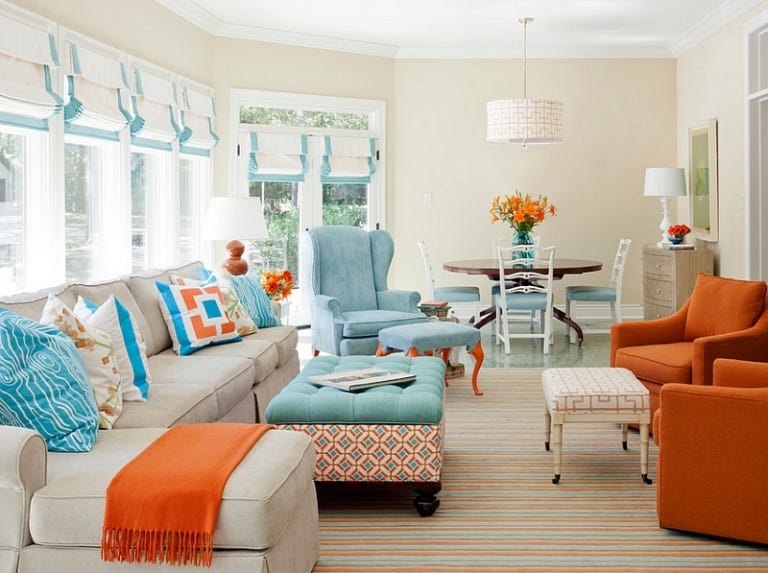
Transforming a house into a cohesive, visually engaging home requires more than simply buying beautiful objects. True interior design relies on the relationship between foundational elements, such as layout, flooring, and large furniture, and the decorative accents that overlay them. When selected thoughtfully, home decor bridges the gap between raw architectural structure and personal expression, elevating an ordinary space into a curated environment.
Many homeowners struggle with a disconnect between their intended design style and the small items they accumulate over time. A space can quickly feel cluttered, disjointed, or cold if decorative pieces do not respect the underlying design language. To achieve a balanced interior, you must understand the rules of scale, color theory, texture variation, and design styles, allowing you to select pieces that enhance rather than compete with your home.
Define and Respect Your Core Interior Design Style
Before purchasing a single vase, painting, or throw pillow, you must clearly identify the overarching architectural or design style of your space. Decor should act as an extension of this theme, reinforcing its core principles.
Mid-Century Modern
This style prioritizes functional organic shapes, clean geometric lines, and a blend of natural materials with synthetic accents. When choosing decor for a mid-century space, focus on minimalism and form. Look for ceramic sculptures with smooth curves, matte finishes, and structural brass candle holders. Abstract artwork featuring bold geometric shapes and earthy tones like mustard yellow, olive green, and burnt orange will naturally ground the room.
Industrial Style
Industrial interiors celebrate raw, unfinished materials like exposed brick, concrete, and iron piping. To complement this rugged look, decor should lean heavily into utilitarian materials. Seek out oversized wall clocks with mechanical gears, salvaged metal storage bins, and distressed leather accents. Textiles should remain utilitarian, favoring heavy canvas, jute rugs, and coarse wool blankets that mirror the architectural grit.
Coastal Contemporary
Rooted in light, airy spaces and seaside relaxation, coastal design focuses on comfort and natural light. Avoid literal, cliché beach decor like plastic starfish or anchor signs. Instead, opt for sophisticated interpretations of the coast. Choose large clear glass bottles that capture the light, white-washed oak bowls, woven seagrass storage baskets, and abstract landscape paintings that hint at water and sand through soft blues, sandy taupes, and crisp whites.
Traditional Elegance
Characterized by classic details, rich wood tones, and symmetrical layouts, traditional design requires formal, historic decor. Look for ornate gilded mirrors, porcelain ginger jars in classic blue and white patterns, and crystal decanters. Framed oil paintings, rich landscape scenery, and heavy silk or velvet throw pillows with intricate piping details enhance the upscale, historic ambiance.
Master the Principles of Scale and Proportion
One of the most common design mistakes is selecting decor items that are either too small or too large for the surface they occupy. Scale refers to the size of an object relative to the room, while proportion relates to how objects look next to one another.
The Rule of Threes
When styling flat surfaces like mantels, coffee tables, or console units, group items in odd numbers, specifically threes. The human brain naturally processes odd numbers as a dynamic, cohesive unit rather than a rigid, sterile pair. Within your group of three, ensure vary the height, width, and texture of each object to create a cascading visual flow that draws the eye across the display.
Ground Objects on Trays
Small decorative items scattered across a large table can look cluttered and accidental. To fix this, use a low-profile decorative tray made of marble, wood, or woven material to corral smaller pieces. Placing a candle, a small vase, and a stack of books inside a tray signals to the eye that these items form a single, intentional vignette rather than scattered clutter.
Balance Negative Space
Every square inch of a room does not need to be filled with decor. Negative space, or the empty areas around furniture and on walls, gives the eyes a place to rest and allows your chosen decor pieces to stand out. If a mantel contains a single, spectacular piece of artwork, leaving the sides relatively clear emphasizes the importance of that painting.
Establish a Harmonious Color Strategy
Color binds a room together. Your decor should serve as the connective tissue that distributes your color palette evenly throughout the entire space, preventing one side of the room from feeling heavier than the other.
Implement the Three-Color Ratio
A time-tested interior design rule suggests balancing a room using a specific color ratio: sixty percent for the dominant background color, thirty percent for the secondary furniture or textile color, and ten percent for the accent color. Your decorative accents, such as small sculptures, throw blankets, and accent pillows, should carry that final ten percent. This distribution ensures that a vibrant shade, like emerald green or terracotta, accents the room without overwhelming it.
Coordinate with Existing Undertones
Pay close attention to whether your room relies on warm or cool undertones. If your walls are painted a crisp white with cool blue undertones, select decor that features cool metals like brushed chrome, pewter, or silver, alongside cool-toned textiles. If your space features warm beige walls and natural oak flooring, choose warm decor materials like unlacquered brass, copper, terracotta, and cream-colored ceramics.
Layer Diverse Textures for Visual Depth
A room styled in a single texture will look flat and lifeless, even if the colors are perfectly coordinated. Mixing materials creates tactile contrast, which adds depth and a sense of luxury to the interior.
Contrast Hard and Soft Materials
If your living room features a sleek leather sofa and a polished marble coffee table, balance those hard, cool surfaces by introducing soft, organic textiles. Layer a thick, chunky knit wool throw over the sofa, drop a plush jute or wool rug under the table, and place matte linen pillows into the corners. The contrast between the smooth leather and the coarse fabric makes the space feel layered and lived-in.
Mix Matte and Gloss Finishes
Apply the same contrast strategy to hard surfaces. On a rustic, coarse wood bookshelf, display smooth, high-gloss ceramic vases or polished metal objects. On a modern, glossy lacquered media console, place rough sandstone sculptures, matte unglazed clay pottery, or dried botanical elements. This interplay prevents the surfaces from blending together into a monotonous block.
Frequently Asked Questions
How do I choose the correct size of artwork for a wall above a sofa?
As a general design rule, wall art hung above a sofa or bed should span roughly two-thirds to three-quarters of the total width of the furniture below it. Hanging a tiny frame over a large sofa makes the artwork look ungrounded, while an oversized canvas that extends beyond the edges of the sofa creates a top-heavy layout.
Should all the metals in my decor match the light fixtures and hardware?
You do not need to match every metal finish in a room. Mixing metals creates a more organic, designer look. To do this successfully, choose one dominant metal for the major fixtures, such as matte black for lighting and door handles, and use a secondary metal, like brushed brass, for smaller decorative objects, mirror frames, and trays.
How can I make sure my personal collections and family photos fit my design?
To integrate personal mementos without disrupting your interior design, create a cohesive framing strategy. House family photographs in matching frames with identical matting board widths, using black-and-white prints for a clean, uniform look. Group small, disparate travel souvenirs together inside a glass display cabinet or on a single designated shelf rather than spreading them across the entire room.
What is the ideal height for hanging mirrors and framed artwork?
Artwork and mirrors should be hung so that the center of the image sits at eye level, which averages roughly fifty-seven to sixty inches from the floor. If you are hanging a piece directly above a piece of furniture like a console table, leave a gap of six to eight inches between the bottom of the frame and the top of the furniture to keep the pieces visually connected.
How do I choose decorative pillows that look expensive and structural?
Look for pillow covers made from heavy, natural textiles like linen, velvet, wool, or thick cotton slub, and ensure they feature hidden zipper closures. For a plump, luxurious appearance that holds its shape over time, always use feather-down or high-quality down-alternative inserts that are two inches larger than the pillow cover itself.
Can I mix different wood tones within the same room?
Mixing wood tones is highly recommended to avoid a sterile, showroom appearance. To balance different woods, identify the dominant wood tone in your large furniture or flooring, noting whether it is warm, cool, or neutral. Then, select accent decor pieces in contrasting wood tones that share the same underlying temperature profile, keeping the grain patterns relatively similar.